Monday, April 1, 2019

Tools to Provide Accessibility

In this day and age, people with disabilities must have access to the Web and digital services just as they would need access to buildings or other services. There are a lot of organizations and services helping and doing just that. As I age, I have noticed my eyesight starting to fail and now I require reading glasses. I couldn't imagine what life would be without my sense of site. But there are many millions of people in the world who are living through it everyday. 


Below is a video of a fantastic Organization https://www.nvaccess.org/ that provides services and open source software to help visually impaired people access to digital technology and the world wide web.


For the visually impaired

Using CTRL + or - keys to magnify the screen

Downloading and using programs like NVDA screen reader   http://www.nvaccess.org/

Using programs like  WEBBIE http://www.webbie.org.uk/ which helps the user fetch data and translates it

Using Braille keyboard and equipment to help with browsing the web and using online services


For Hearing Impaired

Be sure that videos are captioned and the text is in sync and a text transcript is available.

Use clear and simple language 


Here is a video describing how a person with a hearing disability has to go through to experience online.


As Designers of site and Content

Consciously think about how people with disabilities such as visual or hearing impaired, as well as mobility impaired,etc.  How they would experience sites with as little difficulty as possible.

Being aware of color and contrast, size and layout so the site would be legible to as many people as possible.

Using things like Alt Text https://whatis.techtarget.com/definition/alt-text-alternative-text to tell Web site viewers the nature or contents of an image

Be sure to have multiple points of contact( phone,email, social media) so it is easier for people with disabilities to get in touch with content creators


References and sites used


 https://www.hearinglikeme.com/5-ways-to-make-websites-more-accessible-for-deaf-people/

 https://www.nvaccess.org/

 https://www.maketecheasier.com/tools-visually-impaired-blind/

https://www.hobo-web.co.uk/design-website-for-blind/

https://webaim.org/articles/auditory/


Sunday, March 10, 2019

Ethics and Private Policy statement


Ethics Statement
In order to explain my ethics statement I need to give a little explanation about me. I am Scenic artist and Art Director working in the Entertainment business. I have worked in a very wide variety of projects:  films, commercials, live venues, events and theme parks to name a few. Most if not all these projects I would have to sign or acknowledge a Non Disclosure Agreement. Meaning that, I could not distribute or give away information regarding the project or trade secrets used.  I use this ethical code in all facets of my work and personal life. In my studies, I have learned how to properly use information and attribute that information appropriately by using citation guidelines. For my writing assignments, I tend to use MLA style in citation. I use the citation if I am taking a direct quote or a paraphrase that is used in the original source. If accessing online content like websites or blogs, in the reference list I would when that information was accessed. Digital content such as music, video, images I would only use sources that are free to use, copyright free and would still reference and include the source of the creator if available.

Disclosure
I am not affiliated with any company, product or service. However, if I was ever to use or review any product or service I would disclose any affiliation I have had about that company.

Privacy Policy
For visitors that come to my blog, I use Blogger, which is owned by Google. I do not collect or share any personal information with third-parties or collect any data about visits to the blog through the use of cookies. I am not responsible for the republishing of content found on my blog that could be on other web sites without my permission.


Tuesday, December 11, 2018

Final Submission

Part 2 final


I will try and make one more cut to finalize it. I had wish I was able to make one short skit, but I will do so in the future. The theme song could use more work as I just did this in GarageBand.

Monday, December 3, 2018

M6 CP


Animation (Part 2, Stage 3)


Toxic TV


 Here it is  little more finished. Needs final tweeking and sound. Some music, sound effects and some character voices.  Sound will make a big difference.
Please check it out full screen


Here are some works in progress. It has been a struggle learning Adobe Animate, as Ive never used this or Flash before, but Im really starting to enjoy it.
I have 2 slightly different versions. I plan on adding audio, extending the scene as some parts are too fast or not enough rest time. Please check it out full screen.


With Characters at end.


I do plan on animating some of the characters and backgrounds. But probably only simple movements.


Saturday, November 24, 2018

Animation


 Test


This is a test animation I am doing using adobe Animate. Starting simple.
It was from a drawing of one of my old professors from SUNY New Paltz who recently passed away.


To the City


I was going through some of my old videos/files and dug this up.
Back in 1993, I did some stop motion animation of a guy driving. This part is him going to the City, there is another part when hes actually in the city. I used cut out paper and drawing.
I added some free to download music and also added a title to it in WIndows Movie MAker

This is not my submission for the assignment as i want to submit something using Adobe Animate.

Tuesday, November 13, 2018

M5 CP - Animation (Part 1, Stage 1)

Toxic TV


This will need some introduction. Way back, in the early 90s I received a grant for Video art. I created a program called Toxic TV. It was a strange puppet type show about a town that was called Toxic town.  I ran it on public access. It was funny when when my friends and I made it but after viewing it to on tv, I think a lot of people were confused by it. Regardless, was fun to do.
I always wanted to incorporate it with animation. Animation and cartooning was something I wanted to do before I went to art college, but being a fine artist this was Something I never really got around to.


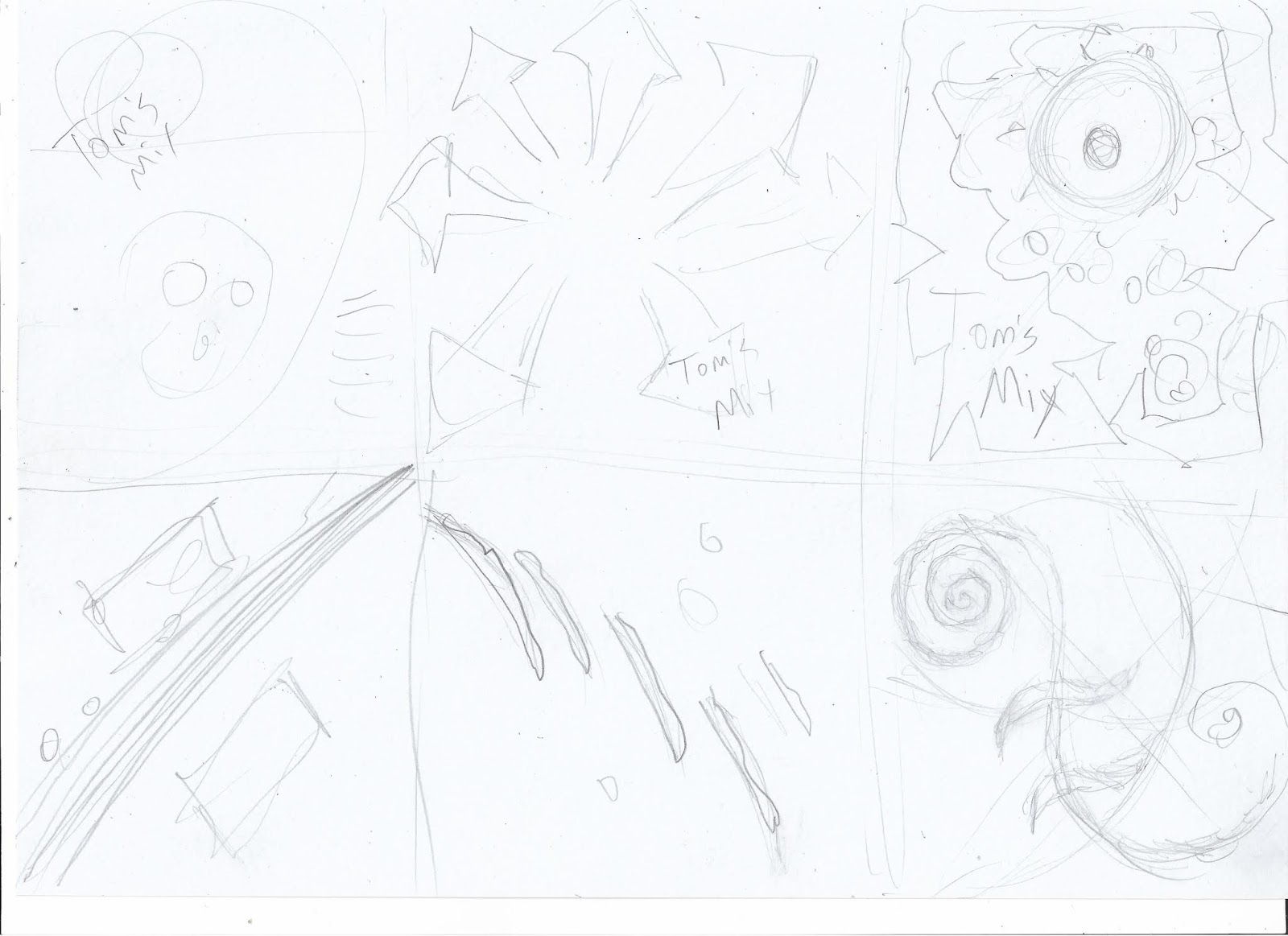
This is my storyboard for the logo and opening sequence. 


I will probably go further and create a short skit, but I figured I would at least make an opening sequence. Here is the concept sketches. I created using adobe sketch. I will take into photoshop and Illustratot further. To animate I would be using Adobe Animate.


Sunday, November 4, 2018

M4 Design Competition Part 2

International Compost Awareness Week Poster Design


Modified version.


Brochure Layout

Done mostly in Indesign but some elements were done in Photoshop and Illustrator. It ended being alot more complicated than I thought because of the fold compensation. I made 6 pages(dividing 3 pages from 1 actual letter size page using measurements found on UniversalPrinting.com on their template page) then formatting 3 pages together, creating registeration marks and slug notes where the folds are. 


Here is my final design. I traced the city image and repainted it, a little more stylized. I learned about saving selections, which I hadn't known before which was a huge time saver for me. I also created a selection mask for the middle plant. I decided to go with a sketchy hand drawn version of Compost, I just couldn't find anything that had the feel I was going for. I decided to a misty air around the swirl. I played alot with levels. then working back and forth into illustrator, was amazing when I reworked the file in Photoshop and saved it , then went back to illustrator it would update it. 

For own sake, I am now putting together a brochure in INDesign and will have that ready in a day or 2


Monday, October 29, 2018

M4 Design Competition part 1


            My workup so far. Will tweek the Lettering in Illustrator


The competition I am going for is:
International Compost Awareness Week Poster Contest
Presented and offered by the Research & Education Foundation (CCREF) 

Deadline is November 5,2018


After I chose the competition I was applying for I had to come up with a game plan.
The fist thing I did was reasearch previous contest winners 
I looked at the various styles, techniques and the caliber level of what they are looking for. Some of the previous winners had an amazing design, so I knew I was up to the challenge.
I wrote some notes and sort of mind mapped what I was going to do.


Then I did some thumbnails, looking at some concepts as well general layout and basic design.


Lastly, I picked a concept to develop further. I still have a way to go but will start taking it to the next step. I will probably do the background graphic in photoshop and the typeface and additional wording in illustrator.

I then plan to take this image and apply it into a brochure layout using INDesign.


Thursday, October 18, 2018

M3 CD Design


 Cover.
 I revised the cover and changed out the font to be the same as the title
I also changed the layout and used shear tool to put them in perspective on the floor


I had to take out the watermark from the image I got by using  clone stamp and brush.
I was looking for Hand written fonts to give a edgy bespoke look. 


Page 1 (Track1)
 Using the transform tool to go along with the wall was tricky but afterall I got it. I tried 
to add some ink splatters

                           
       Page 2  (Track2)
Every page I tried to use a different font, for this one I used an effect tool to roughen it.
Added ink splotches. In Photoshop I added the headphones on the ground..


 Page 3 (Track3)
  I hand drew the Title on the wall, then used shear and transform tools for the lyrics. I also added some sort of glyph thing that is on the window


Page 4 (Track4)

I tried to tweak individual words and letters to give a more hand written look. 
In Photoshop I added the guitar.


  Page 5 (Track5)
 Same process as before, Used some other colors.
Added microphone in Photoshop


 Page 6 (Track6)


  Page 7(Track7)


 Page 8(Track8)
 I added their pictures in the picture frames in this photo. I also grunged it up because it was 
looking way too clean. Positioning the text within the limited space was difficult


 Back
   A little cliche with stage curtains but had to be done


Sunday, October 14, 2018

M3 CD Design PART 1 (Preliminary)

        When I first started thinking about songs , they were from the 90's or early 2000's. Mostly alternative hard rock. One of my favorite artists is Chris Cornell of Soundgarden and Audioslave, so naturally I had one of his songs listed. Then it hit me hard, his death and then that of Chester Benningtons death. I decided to make some sort of tribute cd to them both. I started watching videos of people playing tribute to them and it was heartbreaking and I have to admit the tears did floweth. 
Some of my initial sketches were dark and somber. I wanted some ray of hope and that hope is of course the legacies they both left behind


        One of the ideas I started focusing on was  an empty house. A house full of character. Each room unique and detailed, filled with light or some semblance of life goes on.
The lyrics would be scribbled on the walls of the rooms. Using different styles for each room. I would research and find interesting rooms and tweek them a bit in photoshop, maybe adding different wallpapers or details. Using illustrator for the typefaces and some additional graphics and then using INdesign for the overall layout.


Thursday, October 11, 2018

Album Covers


Frank Sinatra, The Voice of  1946
This album was from 1946.  I had done alot of research of album covers from different time periods. In the 40s and 50s most albums are simple in nature. Mostly depicting the artist or band in a closeup shot with a legible simple and sometimes fun typeface. What I liked most about this album is its use of design especially for that time period.

The overall layout is fun and exciting. The words are jumbled in a way yet frames the face of Sinatra which creates a sense of visual harmony There's also play in color with the use of reds and yellows popping out from the blue. It almost looks like a piece of Calder art, as the forms are balancing around. Your eye wonders from the portrait and around the wording then back to the small print. With some words and icons to draw your attention by using Colors like red and yellow. Franks name is on a black background shape to create deep contrast


Grateful Dead, Aoxomoxoa 1969
 Starting in the mid 60s we have the psychadelic era of album covers and much use of storytelling and layered imagery. The Grateful Dead were very aware of their followers and most of their covers were visual delights. They use alot of Iconography and symbols and even some hidden meanings. I love this kind of art because it makes you really dig in. CAN YOU DIG IT!

The use of the circle in the center pushes out to the main focus of the skull which brings your eyes around back again up the circle to see the seeds springing up these plants. Like an endless cycle. The use of red is strong to really draw your initial attention but the cool blues bring you in deeper.


Bad Brains I Against I  1986
 I have to say but this is one of my favorite albums. Bad Brains are Rasta Hardcore. 
I have so many favorites and I really didnt want to bring any of them in here.
I chose this one because of its simplicity. It reminds me of the classic Doors album with a closeup of Morrison and his band faded back. 

The album is quite literal with I against I. Its so confronting. 
The words at a slant and the font they are in create a certain tension yet harmonize the piece where they are composed. The way the musicians are cut off also brings in a sense of closeness. Hr the singer(to the right) is the one directly staring at you while Dr.Know(guitarist) could be sidelong glancing and rifting on his guitar.


Tuesday, October 9, 2018

UPDATED M2 CP - Identity Design & Branding (Part 2)


REVISED 


took out stroke, drop shadow. I also changed some leading to tighten it up.


Here I changed out the colorful Logo to more subdued..
Instead of adding another silhouette I did a wood grain texture.
 I also changed the coloring and changed the font to a bold. 


Changed out fill of the main font to be lighter value, matching the bottom edge.
 Made the typeface slightly larger. Removed all heavy strokes.
Made the managers name bigger and added additional address.


Thursday, October 4, 2018

M2 CP - Identity Design & Branding (Part 2)

Hudson Valley INN.


This is to be the main logo

I started with finding the right typeface, selected no fill and stroke 2pt. I then found an image and used Place image, selected the text and ticked draw inside mode, moved image to back and moved around to I felt it looked good. I created the top border by freehand pen tool, its supposed to be treeline silhouette. 


Business Card I used the same motif. This card is to be cut out in that shape to make more unique. I added a map because most hotels have that, especially if your foreign and drunk and trying to find your way back.  ITS VERY HELPFUL  


The Restaurant and Bar are simplified versions of the typeface I used. The bar I found some Jpegs and placed inside and Object>Image trace.


Sunday, September 30, 2018

Preliminary work for Identity Design


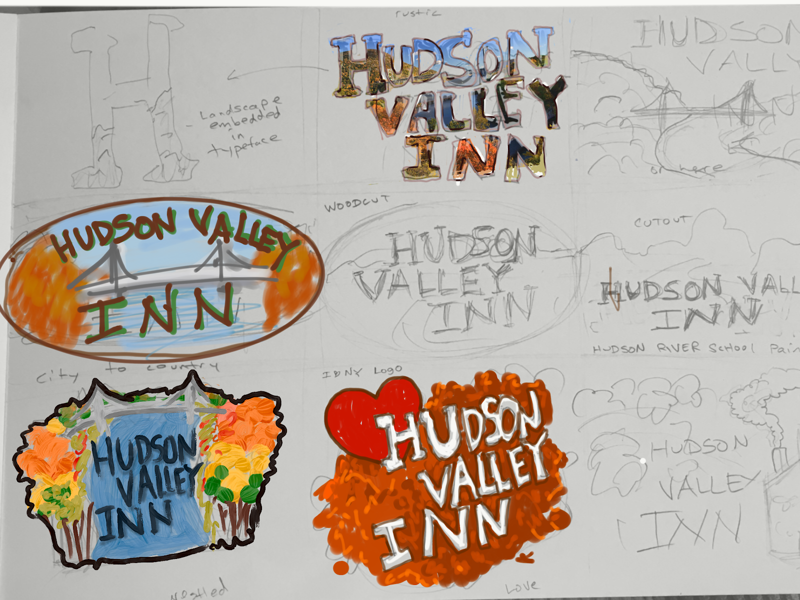
After doing some research on logo branding. I researched other Inns and ideas and also the general feel of the area. Most of the images of Hudson valley came up with the mid Hudson bridge. So I decided to incorporate in some of my ideas. I did a series of thumbnails in my sketchbook, after which I scanned in and colored my favorites on my iPad because in order to show the feeling with colors.

Saturday, September 29, 2018

M2 Exercise 2


 I had to try 3 words. Each one I tried a slightly different method. 


Sleep
 I simply looked up the best font that closely matched my drawing. I didnt want to do much to the font itself. Instead, for the "P"  I used the shear tool and laid it down in persepective. I changed the overall tracking and kerning a bit and added a drop shadow to give it a slight 3d appearance.


 Water
I imported the original hand sketch by using  place , I then used the trace image option to create a vector out of it. After that used expand. It was difficult navigating in there to find the right outline thickness and coloring. I tried gradient but didnt really feel exactly what I was going for. I will probably continue working on this


 Bumpy
I found  a "bubble like" font. Typed in the word then create outline. I isolated each letter, tweeked using the direct selection tool. For the bumps, I added ellipses. Then selected the letter and bumps and used the shape builder tool to merge the objects into each other. I then moved the letters up and down.