Friday, June 29, 2018

Monday, June 11, 2018
M5 Avatar Final part 2

I added a background. Its actually a photo I took when we visited Orlando last year of Avatarland at Disney Orlando Animal Kingdom. I played around with the blur gallery function and used iris blur. I also duplicated the layer then used vivid light as the blending option. It really gave it a otherworld feel. There were some toursits in the background. I used the clone tool to take them out.
I also tweaked his nose a bit and brightened up the eyes. The hair is a bit frazzily but I like it, gave it some comicbook pop
Heres the photo

I really like the whole Avatar theme actually. Really looking forward to the movies. In fact I also created some figure stands last year for some characters we bought there. Sorry Im a dork. haha.

Wednesday, May 30, 2018
M5 create Avatar Part 1
In this sketch, I would get or take a photo with some action pose, making sure the lighting is ok, hair pulled back. Would transform him into this eleven demon hunter using the photoshop techniques learned in this module.
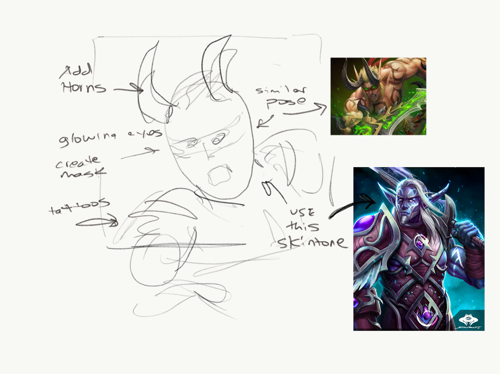
I had created an avatar from my sons photo following utvids tutorial. I feel I could improve it a bit more: adding a background, enhance the nose, create pointy ears, more detail on the eyes
Before

After.
Saturday, May 19, 2018
M4 Book Design part 2

I decided to use a rich blue as the background color. I just really love this color blue and felt it had almost a deep spiritual presence which is what the meaning of the book is about. I then created a gradient glow in the center of the cover, then used twirl effect and liquify on the glow.I picked out this really nice font to coincide with the background, added texture overlay on it, drop shadow, and bevel. My first revision I was going to use a Celtic type of border then I forgot the story takes place in peru so I changed to a Peruvian style motif. I handcolored it in using paint bucket, tweaked the opacity, copied and stitched together
First design.

Sunday, May 13, 2018
M4 book cover design (part 1)
I chose one of my favorite books that I felt the original cover was really bland.


The publisher eventually redid the cover, which I found after I did this sketch. They are both very similar, which is strange because synconcity is what one of the main issues the book talks about.
I wanted to incorporate a beautiful mountain range, similar to the one which was near my school I went to (SUNY NEW PALTZ). I wanted to play around with some filigree around the title. This filigree would be like energy emanating from the title. On the back the same continuation of the background image with a book summary surrounded by more of this filigree.

Another concept would be to play around with the font. probably creating my own style. It would be double or triple layered look a jewel. The title would also Emanate some radiant energy hurling towards the viewer. The back a book summary with a soft glow(it looks hard in the sketch).

Here’s the original book cover.
Wednesday, May 2, 2018
M3 CP Awareness Poster Part 2

Revision 2

Revision.

Final Design.
Took me awhile to learn and play with all the new tools. After following my initial sketch I used that as backdrop to start piecing it together. I researched some images and saving Hi-res.
I would say some of the difficulties were learning how to align everything. I used the ruler function to make guidelines.
Another feature I took advantage of was the effects tool. When double clicking a layer an "effect pop up" will come up. I added some outer glows, bevels,etc.
I also had trouble selecting a background. At first was space, but was too dark, then I started playing with gradient tool. Its multiple layers then I used the brush tool to give the center background a hazy effect.
Saturday, April 21, 2018
M3 poster concept
I came up with 2 concepts and I am still undecided which route to take. I will continue to develop each and see where it leads me.
Initial concept would be to create a horizon of earth in which has several Billboards with corporate names, taking up space and being an eyesores, creating an apocalyptic vision of the earth. The message would be in outer space, forming almost like an attack plan. I would treat as a video game with font and layout to make it easily readable.it would be fairly symmetrical balanced design as the focal point would be going downwards.

This concept revolves around a circle which represents earth but it will be an EKG monitor showing the critical status of the planet. The background would be a faded view skyscrapers but also trees . On the bottom would be icons, almost like buttons, under these icons there would be a brief description what to do.

Subscribe to:
Posts (Atom)